The Belayer app is an Android-based application that helps mountaineers connect/ find new mountaineers to climb a mountain together. The considerable majority of mountain hiking requires a backpacker to have a partner. It was often challenging for persons to sync their outing plans with their family members, buddies, or other hiking partners. Through this application, I tried to resolve the users’ challenges by encouraging them to connect with other mountaineers with the same or similar skillset. Users’ can also meet with other mountaineers based on their preferred schedules. In this project, my role was to define the product’s Information Architecture (IA) & Interaction Design patterns, handling user research, design low-fidelity, and high-fidelity prototype and brand identity.
Project Overview
+ My Role:
Research, Competitive Analysis, User Journey, User Flow, Sketches, Wireframing, Interactive High-fidelity Prototyping, UX/UI Design, Design System
+ Tools:
Adobe XD, Adobe Photoshop, Adobe Illustrator, Pen, Pencil, and Paper
+ Time Spent:
3 Weeks & 30 Hours
The Challenge
Hiking a mountain through tough valleys and peaks can be a challenging and dangerous sport; therefore, to promote trust between users while designing this application to work specifically for mountaineers’ requirements is a considerable challenge. There is no product available that helps mountaineers find a climbing partner in these regards.
The Solution
This application solves the problem by delivering the info that mountaineers need in a context that encourages trust, safety, and community-based on the several usability tests and qualitative user research insights. This application focuses on enabling mountaineers to connect while also providing a reference system that fosters trust between users.
My Work Process
01. Research
02. Empathize & Define
03. Ideation
04. Information Architecture
05. Interaction Design
06. Prototyping & Iterations
Research
First of all,
1. How mountaineers can find partners?
2. What are the problems that mountain climbers will face while searching a new partner?
3. What and how users are looking for in the feasible partners with them they can build trust?
1. How mountaineers can find partners?
2. What are the problems that mountain climbers will face while searching a new partner?
3. What and how users are looking for in the feasible partners with them they can build trust?
Firstly, I started working with a competitive analysis to find similar applications in iOS and Android platforms for mountaineers that helps to search for a new potential partner. However, after competitive analysis, I found that none of the single application provides the easiest way to connect with another partner to find a suitable partner with their different interest and skill level criteria.
To obtain an in-depth knowledge of the attitudes, behaviors, and problems that mountaineers face, I have conducted user research with guerrilla research methods. I have run through 5 interviews with mountaineers to understand their requirements and experiences as well as their skill-sets. I have invited users to the nearest cafeteria and gave them Starbucks gift-cards as an incentive for their precious time and feedback.

I’ve got a crystal-clear understanding of mountaineers’ issues and experiences through these interviews:
- Most users felt demotivated and started doing other less appealing activities because they could not find a way to search for a similar though matched partner who has the same or similar skill-sets and interests for hiking.
- The same level of difficulty, safety concerns, and the same or similar level of experience was the primary key attributes that the users were looking into their potential new partner.
- Age and gender were other factors that impact a hiker’s inclination to hike with possible partners.
- Several mountaineers mentioned that it is difficult for them to trust an unfamiliar person and haven’t met them before.
- I got to know how the possible hiker will match the user’s preferences, like day hiker, overnighter, weekend hikers, backcountry hiker, section hiker, or multi-day distance backpackers were the other notable points during this interview sessions.
Through these user interview findings along with my competitive research, I’ve got enough clarity and ideas to frame my design process about the needs of mountaineers trying to overcome such intimidating problems.
Define & Empathize
1. How do I amalgamate my findings to understand better the needs, objectives, and pain points of mountaineers looking for a partner?
2. How can I verify what mountaineers would use my application for their needs?
Since I have all my findings and research notes with me, I really wanted to empathize with my users to understand their problems and requirements in-depth. In the next phase, I started creating a persona based on my research information, which indicated that beginners and advanced hikers had more-or-less similar issues and wanted equal qualities in potential partners.
Next, I worked on a journey map, which helped me a lot to understand that Jamie is considering altered information about the other mountaineers during different types of his hiking experience.
Merging all my findings and analysis, I then created a list of tasks-to-be-done and task-stories, which helped me grasp high-level expectations users have to find a partner and detailed feature-rich tasks they would perform using Belayer to achieve their goals.

Scope
How might we…?
- How might we connect with other mountaineers who have the same or similar experience and skill levels like me?
- How might we connect with other mountaineers that are looking for the same or similar type of hiking events?
- How might we build confidence and trust between an unfamiliar hiking partner?
- How might we demonstrate to users through the interface that who are looking for a hiking partner around them?
- How might we let mountaineers to form an open network so that they can connect internally when they plan to go for a hiking?
After defining the scope, I worked on an application roadmap to spotlight the most crucial feature to add to my project.
Information Architecture (IA) & Interaction Design
1. How can I define an architecture and design flow that can be user friendly for hikers to connect internally, to search each other and to establish trust?
2. How do I develop community while also considering safety concerns?
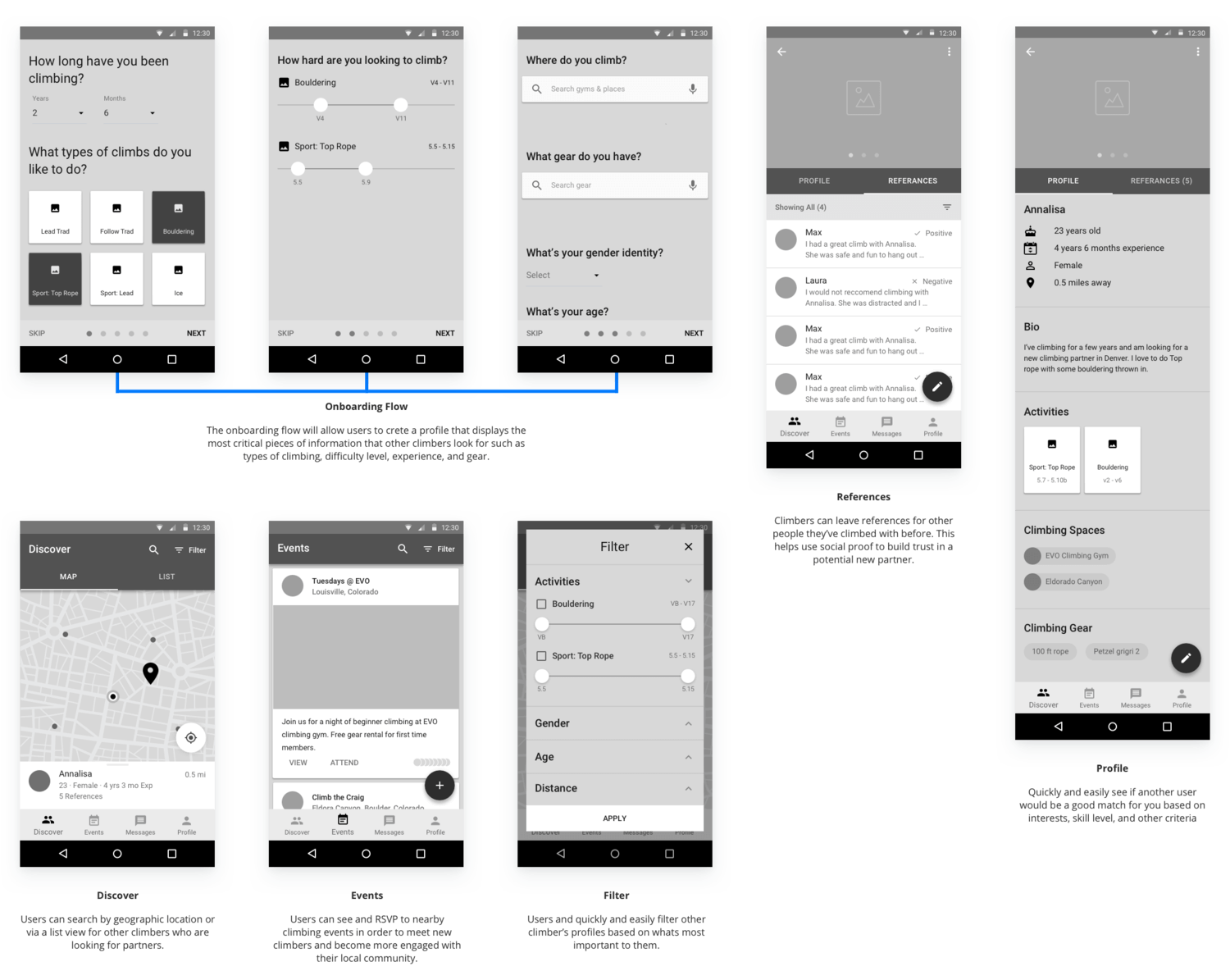
Before jumping straight into the sketches or wireframes, I wanted to create a crystal-clear project flow diagram. I then quickly created low-fidelity information architecture and work flows so that Belayer justified my scope and met the requirements of my target users.

After defining a low-fidelity information architecture (IA), I started work on sketches using a pencil, pen, and paper and created numerous iterations of different user interface screens.

After the sketching phase, I planned to convert my sketch work from low-fidelity to mid-fidelity wireframes. As I had already decided to create an Android platform app, I followed Google Material Design standards and guidelines for my wire-framing. Google Material Design is beneficial to maintain consistency across the application as well as to provide a seamless experience to end-users. I used Adobe XD, a tool to design the mid-fidelity wireframes.
Visual Design & User Interface
How do I design a unique brand that provides a fantastic experience to mountaineers and establish their trust?
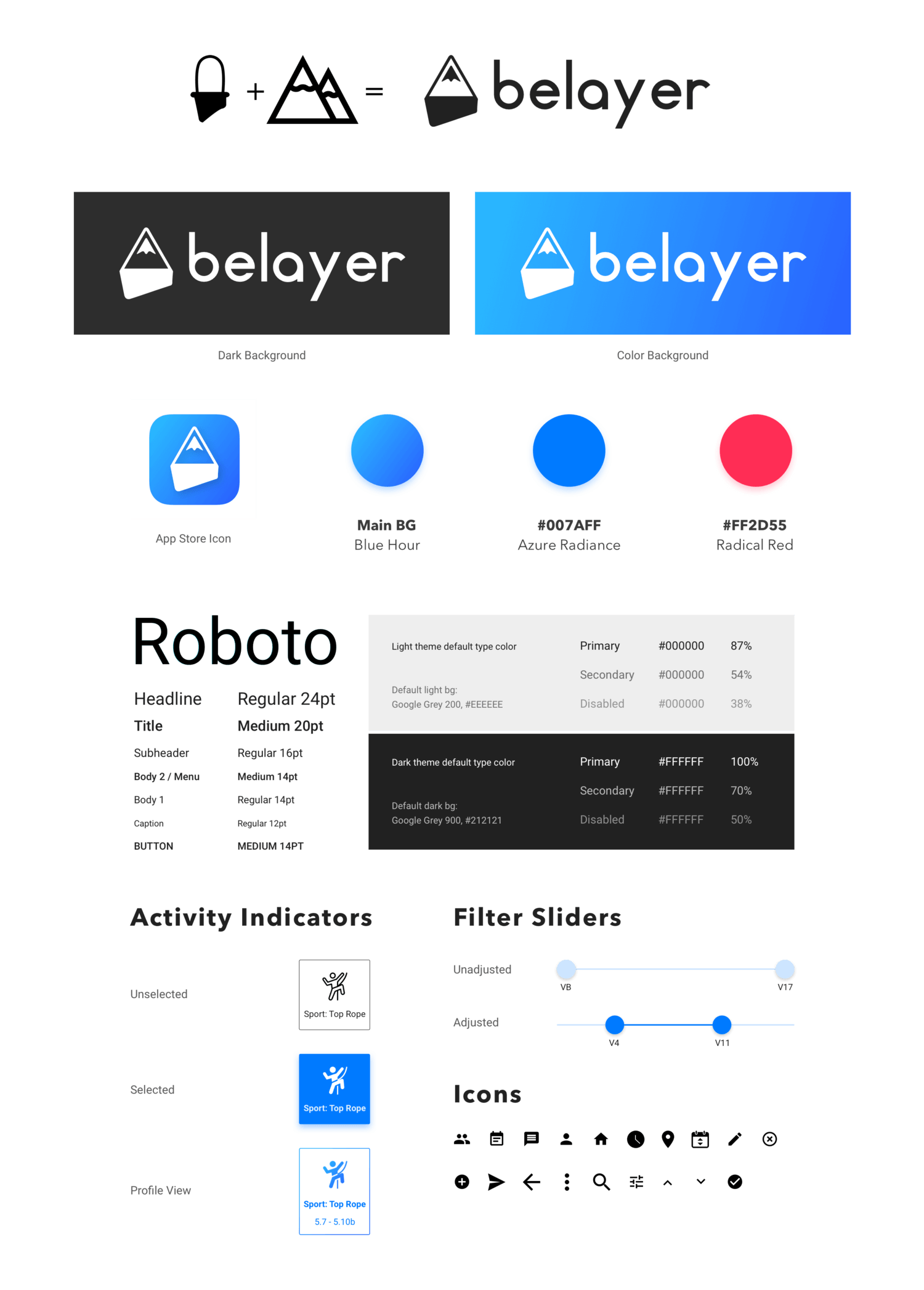
For the visual design implementation, I choose a color palette and design standards from Google Material Design because my application was going to be developed using Google Material Design. After going through various inspiration web platforms, I designed both print and digital-friendly logo versions with b/w and color options. I created a logo blending the concept of a mountain tip and hiking gear. I have also defined typography, iconography, and UI controls.
Prototyping & Versioning
1. How can I analyze my designs?
2. What went on the right track and what didn’t?
3. How can I implement the user’s feedback into my designs?
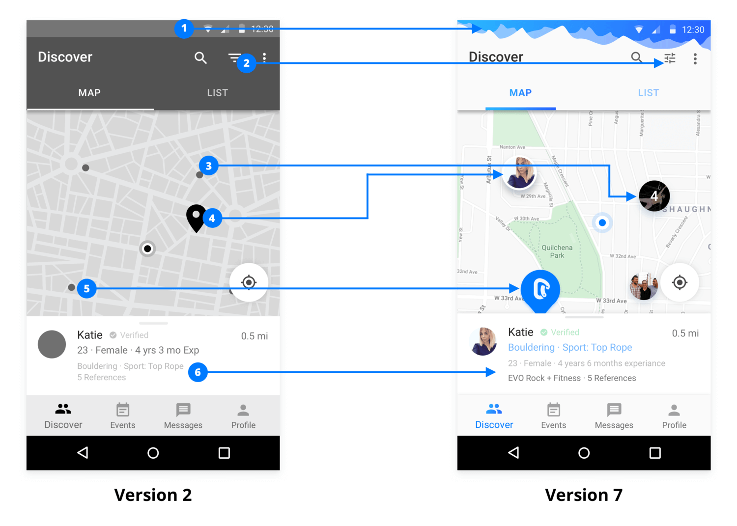
After applying the visual appearance to my sketches and wireframes, I performed several usability tests. Through my personal network, I have invited users on Skype to conduct testing of the application remotely. Users were a mix of freshers and experienced hikers. While scanning each visual screen by users, they found some issues regarding the filter option and some of them having trouble accessing the map.
Considering such feedback, I created another version of my design. I also used UsabilityHub.com in order to perform the usability tests on my various UI screens. I tried to present the feature-rich screen to the users.
Examples of Iteration
Final Visual Design

Research Finding
Type of hiking, skill and experience level and accessibility were the major aspects in trying to search a hiking partner.
How Might We Questions
How might we connect with other mountaineers who have the same or similar experience and skill levels like me?
How might we connect with other mountaineers that are looking for the same or similar type of hiking events?
Result
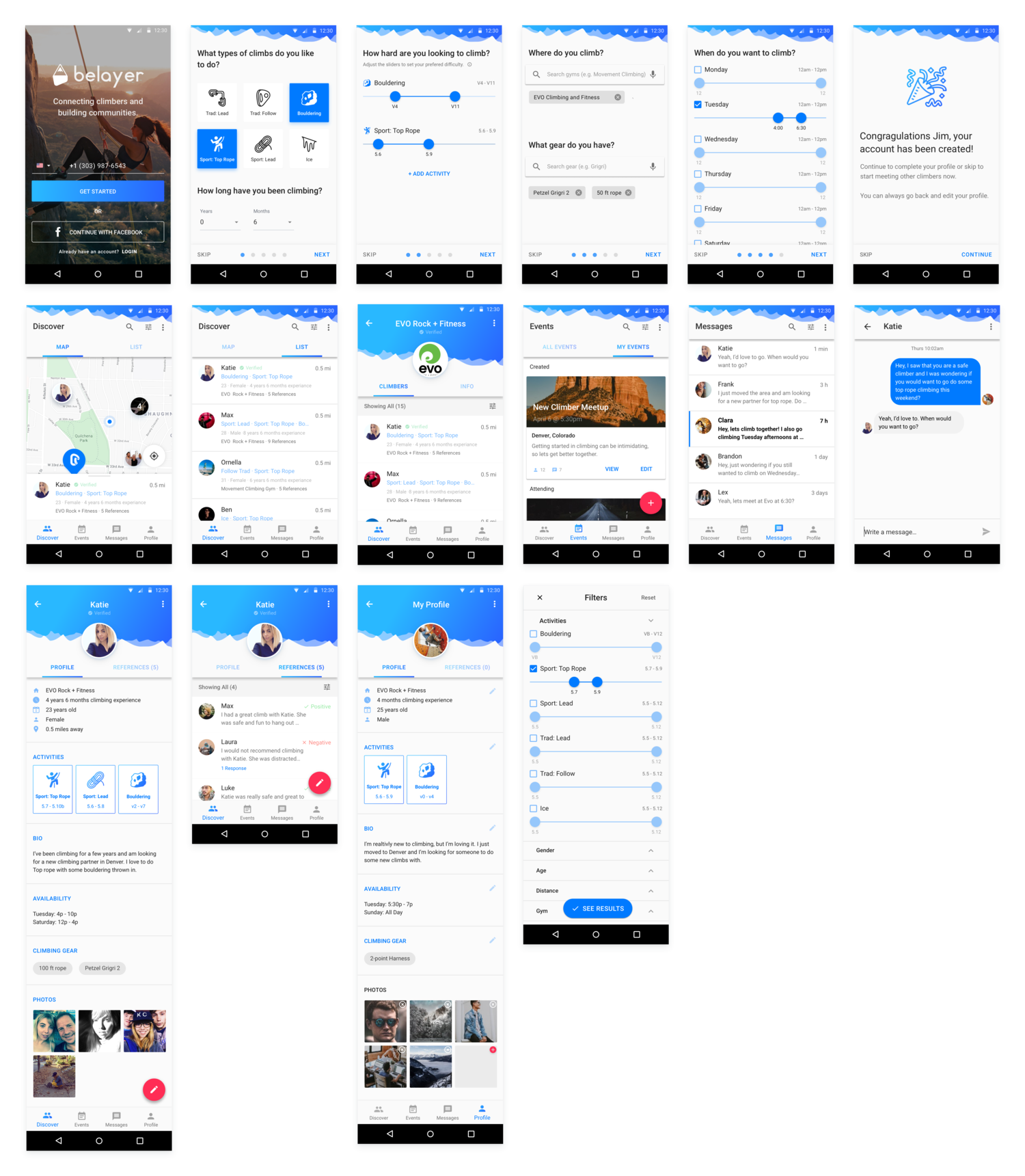
By implementing the filters section in the user interface, users were able to search another users by their skill and experience level, interests, difficulty level and other criteria.
Research Finding
Mountaineers resisted to trust other users they meet online.
How Might We Question
How might we build confidence and trust between an unfamiliar hiking partner?
Result
We requested mountaineers to leave references on other mountaineer’s profiles so that users will see the references and decide on which profile they can develop trust before they meet them in real life.

Research Finding
Mountaineers to meet each other and establish trust.
How Might We Question
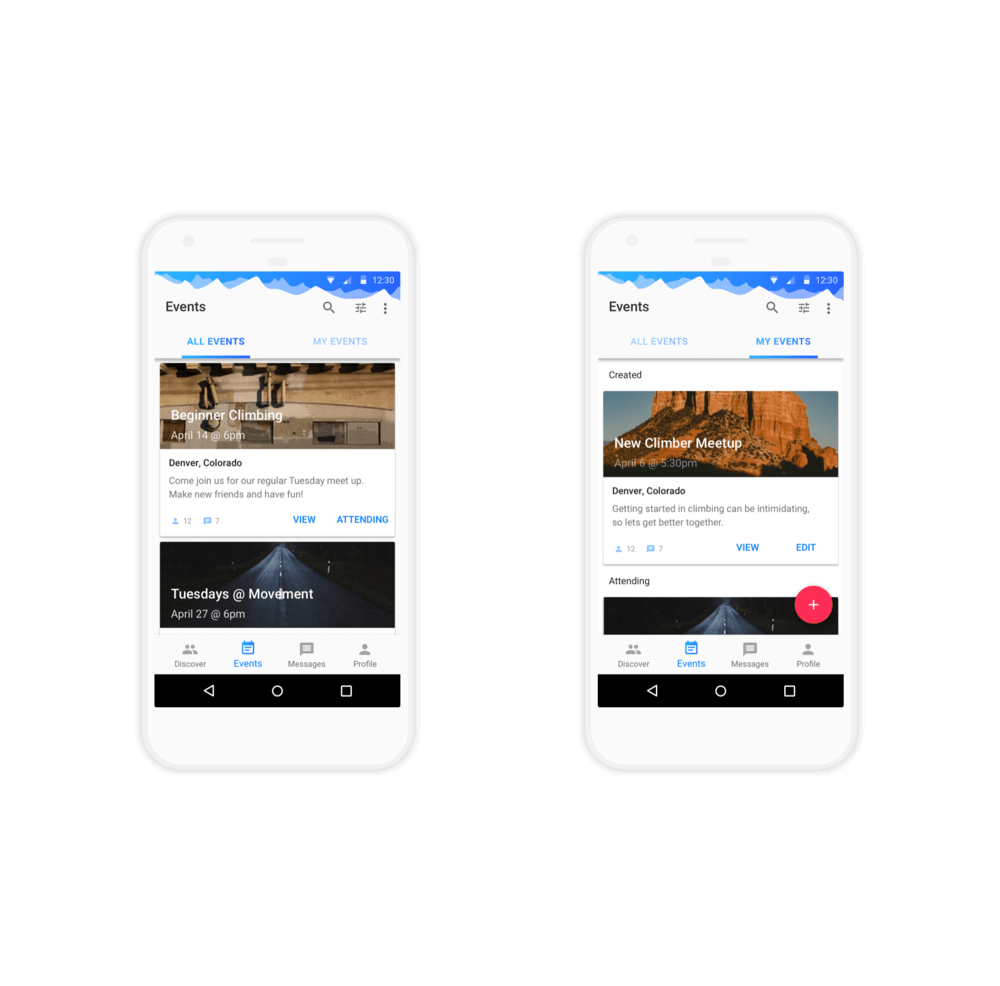
How might we let mountaineers to form an open network so that they can connect internally when they plan to go for a hiking?
Result
Under the events section, users can browse and join events that can be filtered based on the user’s preferences. Moreover, users can host the events as well as see which events they are attending.
Research Finding
Nearby areas like gym, café, community meet-up places could be the best areas to find the new partners.
How might we questions
How might we demonstrate to users through the interface that who are looking for a hiking partner around them?
Result
Users can see possible new hiking partner by discovering a map or by viewing a listing of other nearby mountaineers.

User’s Feedbacks
“This is an amazing app that I would love to use because it clearly focuses on getting the tasks done.”
“I love this app. I can’t wait to use it.”
“I really love about how nicely the events are integrated into an experience.”
Takeaways
The things which I learned from this project
This was indeed a remarkable project for me to work on as a UX UI designer. It pressed me to execute a design solution within a completely new design system. Before this project, I only got exposure to working on an Android application as a visual designer, where I got wireframes and screen concepts already been provided by the business analyst, and I just need to work on its visual appearances. But through this project, I’ve got a broad knowledge to understand user’s pain points, how to deal with user’s feedback, how to present the live design to them by resolving their questions and queries. Receiving positive feedback from the users was the most significant proof of this application’s success.


