ecoHome is a product concept for a smart dashboard application. It manages household usage for gas, water and electricity, and provides insightful data into user’s individual device consumption. It also provides comparative data with other households to keep users better informed. Last but not the least, ecoHome connects and interacts with smart devices.
Smart Dashboard Application
Strategy, Research, UX/UI Design
Project Overview
+ My Role:
Research, Competitive Analysis, User Journey, User Flow, Sketches, Wireframing, Interactive High-fidelity Prototyping, UX/UI Design, Design System
+ Tools:
Adobe XD, Adobe Photoshop, Adobe Illustrator, Google Analytics, Hotjar, Pen, Pencil, and Paper
Initial Research
User Interviews – Identify Existing Problem
The first step was to go out and speak to users, to recognize pain points and information gaps. I set up 1-on-1 interviews:
- Most users complained of lack of detailed visibility into their utility consumption
- Many of them were unaware of problem areas like leaks or faulty appliances within their homes
- People disliked seeing surprises in their monthly bills
- A lot of them wished to get more guidance on energy saving initiatives
Surveys – Understand Needs and Behaviors
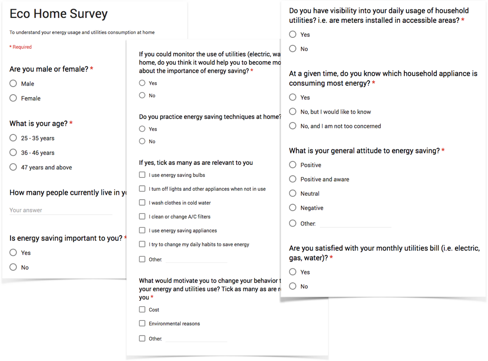
After interviewing a small set of users, it was important to get more quantitative data to validate some assumptions and get more insight into user needs and behaviors. Surveys are one of the simplest tool for gathering information. As a research method, surveys allow to quantify concepts, the learnings from which can then be applied to a broader population. They also help identify what users want, where they currently get their information, and what it would take to possibly change less optimal behaviors. Below are some of the questions from the larger survey questionnaire:
Survey Questions
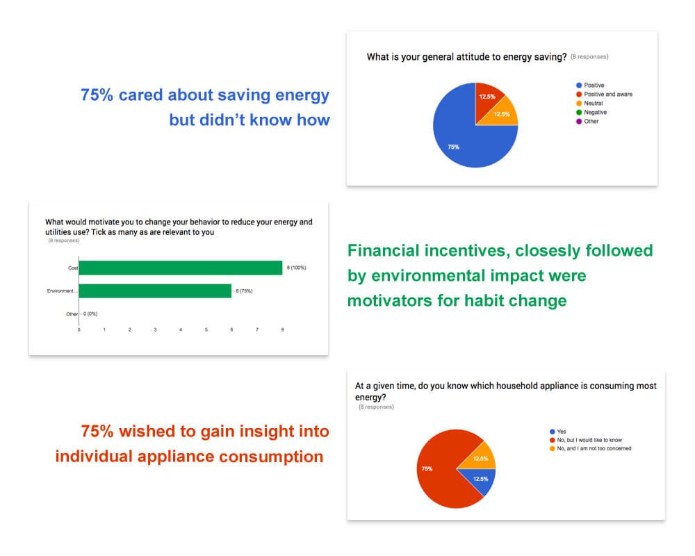
The next step was to collate all the feedback received, and establish common patterns. It was interesting to see how people felt about energy saving and what it would take to alter their current habits.
Survey Result
Competitor Analysis – Identify Market Fit
To identify areas of differentiation and market fit, I performed extensive competitor analysis. I found some surprising insights:
- None of the competitor products had a unified solution to address all of our top-level concerns
- Most of them had limited insight into other households’ usage
- There was little to no assistance on suggestions or predictions to guide users into altering their habits
- Lastly, although a few them packed in a lot with regards to functionality, many of them had a sub-par user experience
Ideation
Archetypes
Renaissance Millennial
– Enticed by the promise of smart home technology, caught up in the “euphoria of connectivity”
– Cost-conscious and an early adopter of technology
Mama Bear
– Prioritizes convenience above all else
– Children’s safety and well-being is of utmost importance
Green Evangelist
– Efficiency and sustainability at the top of their mind
– Loves seeing energy savings on their monthly bill
Use Cases
After all that initial research, I came up with a list of typical use cases that would satisfy most of our user archetypes:
- View usage over time
- Compare usage with historical data
- Know about possible overage or outage
- Compare usage with other households
- View individual appliance consumption
- Set monthly spend
- Track carbon footprint to promote sustainability
- View/Interact with active connected devices
- Add/Remove connected device
- Add/Remove provider accounts
User Flow Diagram

Design
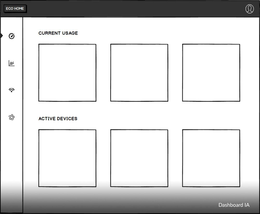
Information Architecture
After speaking to users and defining use cases and user flows, the next step was to envision the UI for some of the most common use cases.
The first screen below lays out the dashboard structure. The black top bar, provides cumulative info about their total savings and cost incurred. The left nav gives quick access to jump across sections within the UI. The central block contains sections for customizable, all while keeping visual hierarchy and content organization in mind.
Screen 2 (Dashboard UI) is a detailed view of all the relevant information for a user to glean over, once they log into the dashboard system. The section on top provides instant insight into their current usage. The section below provides a real-time view of individual room consumption for all active devices. The last block in the bottom right lets users set scenarios for their entire household to provide an additional layer of customization and convenience.
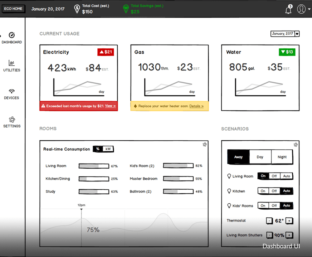
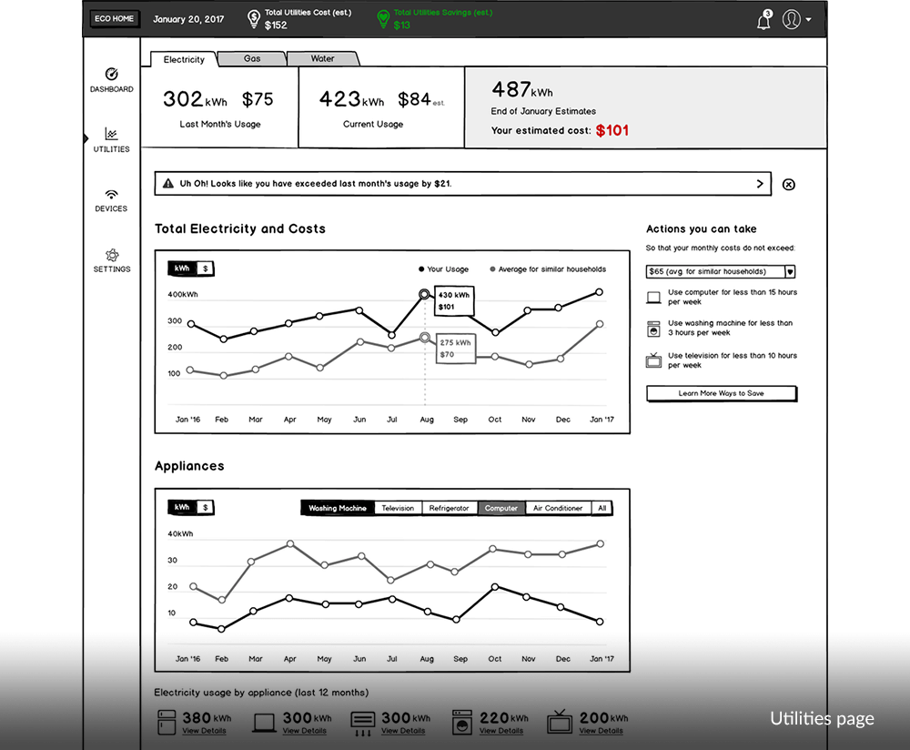
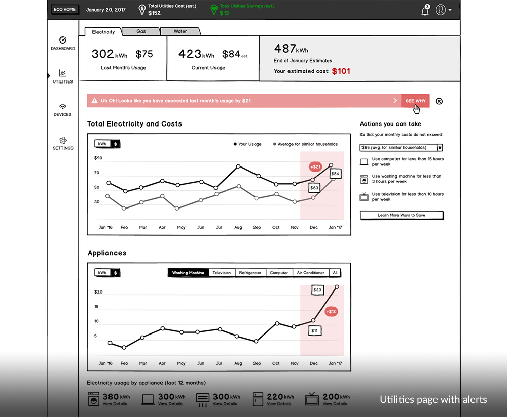
Screens 3 and 4, provide detailed information for individual utilities like electric, gas and water. This page can be accessed by either clicking on the respective widgets in screen 2, or clicking on the “Utilities” tab using the left vertical navigation.
Visual Design
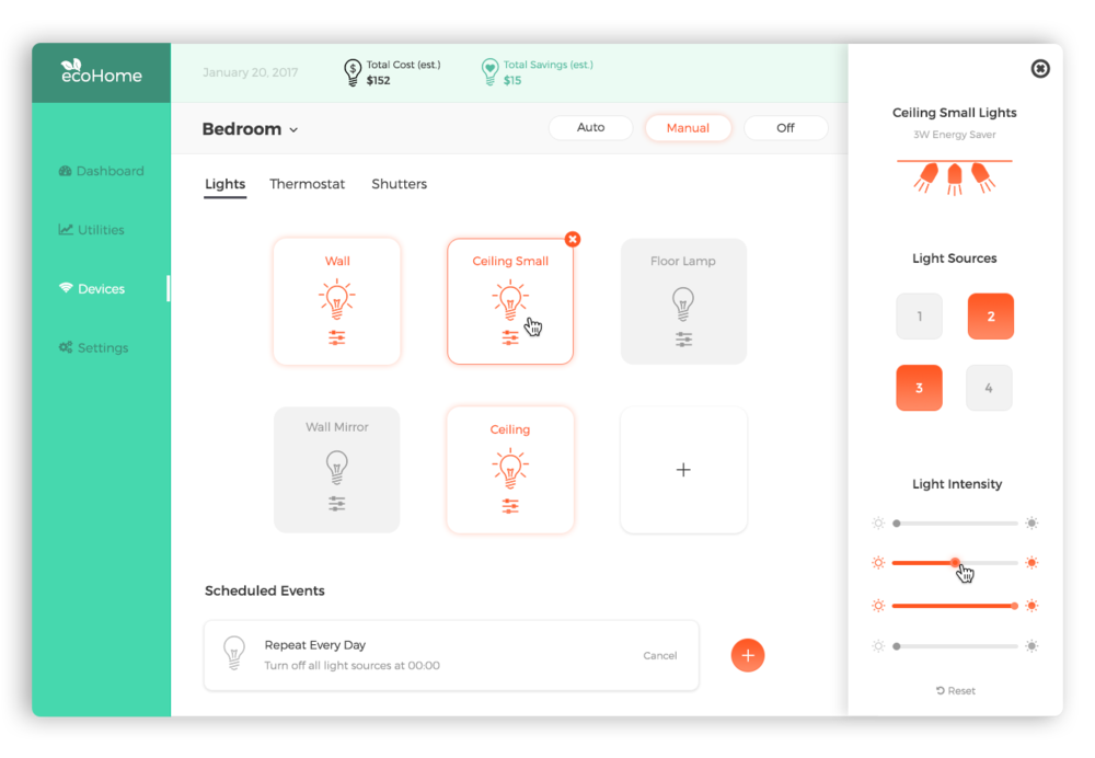
Below is the design for the connected devices tab. This allows users to see and control all their smart devices. The devices are displayed by room and users can tweak individual settings for each of the devices (see side-tray control below).
Additionally, users can schedule timed events for specific devices, thus providing granular access, all in one place.
Visual Mockup – Connected Devices
Takeaways
ecoHome provides the ideal connected home experience by maintaining transparency and education at every step of the way. It provides a single, personalized interface and uses data-driven insights to keep its users informed.