I am working on creating version 2.0 for an Interactive 3D Railing Designer application for mobile, tablet, and desktop devices in this on-going project. I’ve been working on an engaging application that helps users convert their ideas about how to design their railing systems, deck, backyard, patios, balcony… etc., into an interface. I have participated in user research and design for this project by conducting user interviews, analyzing their pain points for the existing (version 1.0) application, defined user journeys, and prototyping of the final product, ensuring the ROI aligned with the Peak and The Home Depot’s guidelines.
Peak Railing Designer
UX/UI Design, Cross Platform Web Application
Project Overview
About Client:
The Peak is a highly valued, strategic partner of Home Depot, the world’s largest home improvement retailer. Their unique business platform aligns with Home Depot in its mission to serve the do-it-yourself, do-it-for-me, professional customer, their best-in-class products, and a broad range of home installation services are offered extensively throughout Home Depot’s massive retail network. Peak and Home Depot customers in Canada and the USA have been creating interactive railing design projects using Peak Railing Designer (Version 1.0) tool for 3.5 years now. Through this new version 2.0 of the Railing Designer application, users can plan, design, and price their projects in minutes to comfort their home.
+ Team:
Team of 6 people including myself as a Sr. UX/UI Designer, Product Owner, Two Software Engineers, Marketing Coordinator, and Software Tester
+ My Role:
Research, Competitive Analysis, User Journey, User Flow, Sketches, Wireframing, Interactive High-fidelity Prototyping, UX/UI Design, Design System, Scrum
+ Tools:
Adobe XD, Adobe Photoshop, Adobe Illustrator, Google Analytics, Hotjar, Pen, Pencil, and Paper
+ Timeline:
8 months
The Challenge
Currently in the existing application, due to confusing, low-engaging, and poor usability standards in the interfaces, users aren’t able to complete their journey and drop off in the middle of the application without getting the estimations for their railing project.
The Solution
By performing multiple usability tests, qualitative research, and users’ feedback this application will serve its purpose by allowing users to complete their journey in a minimum time. Users will be able to design their railing projects on desktop, tablet and mobile devices. Users will get the accurate estimations for their home decor projects and with these accurate estimations they can purchase the components straight from the Home Depot.
My Work Process
01. Empathize & Define
- Project Goal
- Problem Statement
02. Research
- User Research
- Existing Application Problems
- Persona
- Google Analytics & Hotjar Insights
03. Ideate
- Competitive Analysis
- User Journey
- User Flow
- Sketching & Wireframing
- Prototyping
04. Test
- Usability Testing
05. Iterate
- Visual Designs
- Style Guide
- Design System
01. Empathize & Define
Project Goal
While redesigning the existing application, our primary goal is to provide users a seamless, interactive, and engaging experience so that they can quickly and effortlessly convert their home décor/ improvement visualizations into an interactive experience with accurate plans, designs, and pricing estimations.
Problem Statement
Before diving straight into the user research, design process and coming up with a solution, I have focused on identifying issues with the current application as well as I’ve framed a problem statement by identifying below 5 Ws:
- What is the application?
– a web browser based application for mobile, tablet, and desktop devices. - Who is it for?
– for the Peak Group of Companies and the Home Depot’s end-users who are looking for build a home-improvement projects. - Why is it required to be redesigned?
– to provide mobile device support and improve conversion rate so that as much as users can complete the designs and get accurate estimates for their home improvement projects. - What does it need to do?
– make it interactive, user-friendly, easy-to-use, and engaging for the users to complete their railing design tasks. - Where/ When will it be used?
– users can use this app on their mobile, desktop, or tablet devices while sitting at their homes to design their home improvement ideas and instantly get accurate estimates.
02. Research
User Research
After analyzing the users’ pain points in an existing application, user’s frustrations, and Google Analytics and Hotjar insights, I then jumped into the actual qualitative and quantitative user research by connecting the current users and the potential new users.
- For qualitative research, I’ve conducted user research to our office premises, and I have invited six users (between the age group of 26 to 54 years). The research session was scheduled for 60 minutes. During that time, first, I have shared my predefined questionnaires with them and what they expect from the new application to achieve their tasks/ goals. We rewarded each user with a $25 Tim-Hortons gift-card for participating in the research.
- For quantitative research, with our Marketing Coordinator’s help, we have circulated questionnaires to our existing more than 1800 subscribers through SurveyMonkey.
- Focus Groups – we (as a team) reached out to the Home Depot PRO desk to understand the users’ nature, behavior, and feedback about the Peak’s Railing designer tool (v1.0) as well as all the products quality and installations.
– Based on the PRO desk team’s feedback, we get to know that the current Peak Products’ users are very frustrated with the Railing Designer V1.0 because of its lacking features like FAQs, Walkthrough guides, Installation Guides and Videos.. they are unable to complete the design. Moreover, the old-fashioned design and wizard-based design user feels the V1.0 design flow is very lengthy and complicated.
Pain points with the old (V1.0) application
1. Very Lengthy Workflow and Confusing Interface
– The existing (V1.0) application relies upon a ‘Wizard’ that guides the customer through all of the required steps in order to complete the reasonably complex process of designing a railing project. Wizards are effective in making sure that all users go through all steps, but in the case of this application, ¾ of the users only require a small subset of the steps or processes but are forced to go through all of the steps. This was a bit clumsy and can be quite confusing for the end-user.
Based on Hotjar findings, I found that all users couldn’t seem to figure out how to get going from the very first screen. They started clicking randomly on the screen, trying to draw a shape. Quickly, after realizing that this wasn’t working, they looked around and found the controls. Therefore, based on this scenario, I figured out that there should be some animated hint or walkthrough screens in the application’s launching to clearly understand what to do and how to proceed with the interface.
– Annoying numerous popup windows also provides a worst experience for the user to complete the user journey. For every single action, a mandatory popup screen has been implemented in the system, which distracts a user to perform the actual design.

2. No Mobile Device Support
Between 55% to 65% of Home Depot’s website traffic in both Canada and the USA comes via mobile devices, but as the existing system doesn’t support in mobile device it redirects the customers to a separate landing page that speaks to the value props of the railing system, contains the video, testimonials as well as tentative pricing estimates. The page also lets the customer know that they need to use a full-size browser to do a custom design. As this wasn’t the ideal experience many customers were exiting from the application.
3. High Bounce Rate & Meager Conversion Rate
As the application wasn’t developed for mobile devices, many users coming through the Home Depot portal were not able to complete the railing design for their needs which resulted in a high bounce rate and poor conversation rate measured through the Google Analytics metrics.
4. Slow Performance
Many custom JavaScripts and 3rd party APIs have been used in the existing application which make it very slow.
5. Rigid User Flow
Due to the wizard based interface, the workflow of the system is very rigid. If a user wants to edit the railing design parameters (for example, railing color, railing dimensions, or components), he has to start over the entire process, which makes the system more rigid. There is no way in the current system to edit the parameter in between the flow.
6. Poor Usability Standards
There was no color theory, typography, iconography and accessibility standard defined across the pages. Therefore, based on Hotjar reading, I was easily able to spot the user’s frustration while accessing the application.
For instance, the screen below has equal weightage for ‘Let’s get started’ and ‘Cancel’ buttons. There were no primary and secondary buttons defined in the system. Along with that, there was no visual indication about the required fields (for example, ‘*’ next to the field) therefore if the user clicks directly on ‘Let’s get started’ system throws a notification to fill the details.


The above screen was just a single example of poor usability used in the old system. Other than that, I was able to find numerous errors and improvement areas in the existing application.
Persona
Based on the initial user research performed I have identified a persona of an interior designer as shown below.

03. Ideate
Competitive Analysis
After the research phase, I began with the ideate phase by starting the competitive analysis. There are a couple of interactive applications out there to design furniture, home plans, apply paint to house walls, etc. But there is no specific application available that can help users with their home decor solutions. Especially with our Railing Designer product, we were targeting the mobile and tablet devices, which makes Railing Designer unique among other applications.
Sketching & Wireframing
After all the groundwork was done, I was then able to demonstrate the application’s complete functionality and its noise measuring capabilities by creating interactive prototypes.
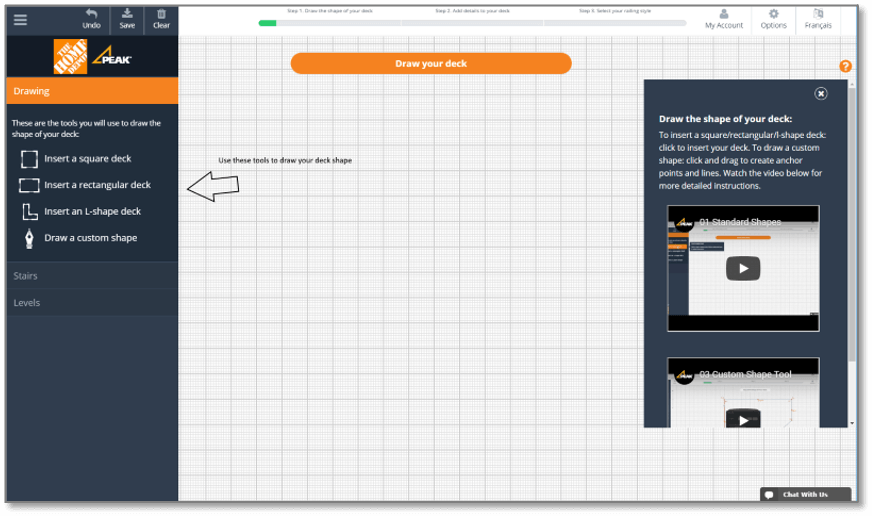
Existing application has very confusing ‘Wizard’ based interface, which doesn’t give enough information to the user about how to proceed further with the application. While, in the new application, I have simplified the user flow by adding a walkthrough screens in the beginning of the application. Even considering the returning user scenario, I tried not to display the walkthrough screens as an autoplay mode. For the returning user, if user want to view the walkthrough screens again, he can go to settings and run the walkthrough again.
Here is the before and after interfaces of the application.
Before walkthrough screens
After walkthrough screens

I then created entire prototype for desktop and mobile devices including all micro level scenarios.
Prototype for Desktop

Prototype for Mobile

04. Test
Usability Testing
After the interactive prototyping, I have performed a usability test using UsabilityHub.com. Through this, I have received many feedbacks from internal team and users about minor flow and design changes.
05. Iterate
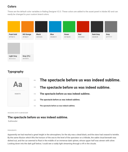
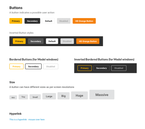
UI & Visual Design
As the company’s branding was already being defined in the visual design phase, I followed the logo colors as a base. Moreover, I have determined the form components and style guides for the developers to develop further.


Final Visual Design
Success Notes
- Since yet, only the beta version of the new railing designer application is launched. Though the Peak and The Home Depot users have completed more than 38,500 designs, and among these users, more than 26,300 users have successfully generated the parts lists and obtained accurate estimations.
- With the launch of the beta version of the new railing designer application, the sales of home improvement products and components are increased by 319%, which was a remarkable success for the Peak Group of Companies.
- Due to intuitive and self-explanatory railling designer tool – components inquiry, pricing inquiry, installation, and compliant related calls are reduced by 67%.
Takeaways
What lessons did I learn from this project?
Indeed, this was a fantastic project to work on as a UX/UI designer because it inspired me to design the best solutions within a new design system. I had worked on many web applications before. Still, this project allows me to understand the users’ frustrations in-depth with the previous application. On top of that, using qualitative and quantitative research outcomes, I had a clear picture in my mind about how to come up with a crystal clear solution for the users so that it can be a win-win situation for the end-users as well as my company who is investing a lot of efforts to develop such a seamless application.
Moreover, this product’s remarkable success measurements keep me motivated to provide better and better solutions for this application.